Logo Design
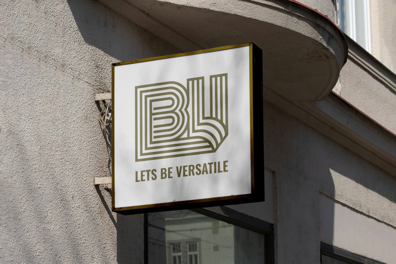
The Story Behind The LBV Logo
From Hand-Drawn Beginnings
Every line in my logo started as a hand-drawn stroke in Procreate, no templates, no shortcuts, just pen to screen and a vision. I wanted the design to feel personal, tactile, and real, something that reflects my hands-on approach to design and the print-is-not-dead mindset I live by.
Lines That Lead Somewhere
At first glance, it’s a simple composition of letters: LBV, the initials of Let’s Be Versatile. But look closer, and you’ll see something more, lines that cross, meet, diverge, and flow.
That’s not by accident.
Each line represents a different path, because as a designer (and a human), I believe there’s more than one way to get somewhere. I take pride in being adaptable: switching styles, mediums, and approaches depending on the project, the story, or the problem to solve.
A Versatile Mark
The layered structure mirrors the versatility at the core of my practice. Whether it’s screenprinting, digital branding, or custom apparel, I design with flexibility and movement — just like the lines in this logo.
From Sketch to System
Once the hand-drawn foundation felt right, I brought it into Figma to refine it into a consistent, clean, and scalable mark. Even in its final form, you can still feel the human hand behind it, and that’s exactly the balance I was going for: crafted, yet clear.
Unique, yet usable.


The Colours Explained
#022F4F
#17798D
#F4E9CD
#968003
#271302
The Colors of Let’s Be Versatile This palette was carefully chosen to reflect who I am and what I stand for as a designer. Each color holds meaning, grounded in nature, creativity, and the raw beauty of imperfection. #022F4F – Deep Navy A steady, thoughtful blue that represents depth, trust, and clarity. Like the ocean at its calmest, it reflects the focus and integrity I bring to every project. #17798D – Teal Blue Inspired by open waters and creative flow, this teal captures movement, versatility, and my love for exploring different paths, both in life and design. #F4E9CD – Soft Sand A gentle, neutral tone that brings warmth and balance. It creates space to breathe, echoing the calmness and simplicity I strive to bring into my work and into the world. #968003 – Earthy Mustard Bold yet grounded, this earthy yellow ties me to nature. It speaks to organic textures, golden light, and the kind of creativity that grows from real, hands-on experiences. #271302 – Espresso Brown Rich, raw, and full of character, this dark brown represents authenticity. It's the foundation beneath the surface, and a reminder that beauty often lies in the unpolished.


Company:
Lets Be Versatile
Business:
Creative Design Brand
Let’s Be Versatile’s logo is a reflection of genuine creativity and connection to the earth. With colors and shapes inspired by nature, it’s designed to be adaptive, inspiring, and ever-evolving

